Everyone at Fastly is connected to the customer experience in the work that they do, no matter their department or professional expertise. It’s a value that drives our decision making, and we’ve learned a lot from embracing this credo. Like, for example, what got us to today might not be the right thing for tomorrow. Developers' needs change, the industry changes, and the needs of our customers change, too. Given our collective focus on continually improving the customer experience, we need to be disciplined to make sure our products and practices continue to meet our customers’ needs into the future.
With that value in mind, we began a deliberate process the past few months to determine if Fastly’s user onboarding and feature discovery experience would continue to serve our customers into the future. Were we showing them the right features at the right times? Were we conveying the full potential of the edge cloud? And most importantly, were we setting them up for success with the platform? In our UX design process, we applied research and data in ways we never had before, challenging every assumption we had along the way. In the end, we rebuilt our core experiences in an ambitious way, laying down the foundation for happy customers, today and tomorrow.
We believe in transparency, and in always creating an environment where you can share what's working for you and what changes we can implement to make your life easier. Which is why we're sharing a more in-depth look at our recent onboarding project below, and how we go about continuously iterating and improving (hint: it's all about you and your experiences).
Where we started
When we first took on this project, many of Fastly’s core interfaces were built to show the functionality and components of the edge cloud in a straightforward, equal manner. Users were primarily presented with building blocks, or components designed to be connected together to build a solution. While this was attractive to power users and early adopters, there was a lack of instruction that was intimidating to a significant portion of our new customers. In order for Fastly to continue help scale the best sites on the web, we knew we needed to rethink how approachable we were to newer customers — while still retaining the functionality that catered to our early customers and those super familiar with our platform.
Getting our bearings
We had strong hunches about what areas we could improve upon, but we also knew there were likely problems we hadn’t discovered. Also, we didn’t have a strong understanding of how costly these issues might be . Our team knew we needed to rely on research, rather than our intuition, to find answers.
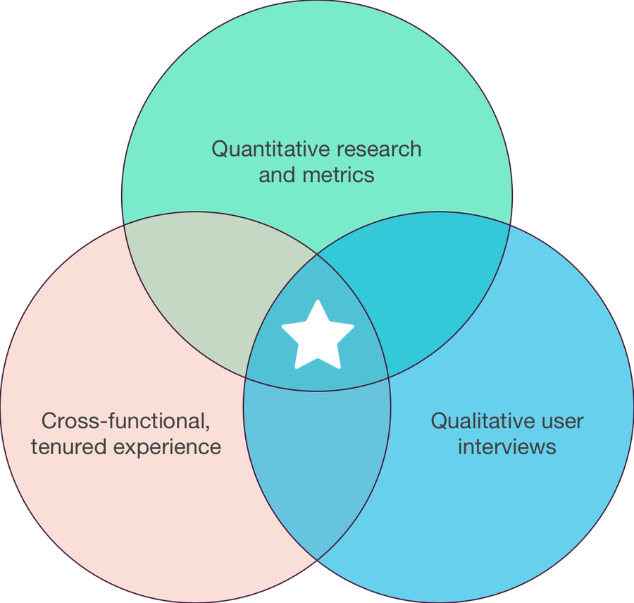
The framework we applied to this research was multi-pronged. We wanted the best of quantitative research, while still getting the deep context of interview research, and the ability to leverage the experience that Fastly employees from other departments have had over their tenures. Before we delve into the specific challenges we uncovered and the solutions we built, here’s a snapshot of how we approached our research and what it entailed:

Quantitative research and metrics: This methodology is potentially the most popular research method in the technology space. It’s a scalable research method, the most objective common practice today, and it allows introverts to get some insightful data, if they're shy about interacting with others. The systems we’d used for metrics in the past were designed for easy, directional one-off reports so we could get things done quickly, but they didn’t provide the scalability we needed. This project was a great excuse for us to rebuild our testing and usage metrics from the ground up, and in doing so, we were able to not only gain learnings for this project but for how we can test in the future.
Qualitative user interviews: Our customers represent the best of the web. And we partner with them in the truest sense of the word, collaborating on each others’ products and businesses for the long term. Because of these deep relationships and strong goodwill, it was easy for us to line up numerous customer interviews about our product experience. When it came time for usability testing, these same customer were the deep bench of beta and limited availability (LA) testers we needed. Our user interviews didn’t stop with existing customers, however. We leveraged modern research tools to identify people similar to our customers, but with no direct Fastly experience, adding another valuable perspective on our current application and our prototype solutions.
Cross-functional, tenured experience: One of our greatest advantages is our ability to retain our veteran employees. Nearly 25% of our over 500 person workforce have been with Fastly longer than four years, moving within roles and departments as their career goals progress. Our founders, as well as many of our earliest engineers, operators, salespeople, and product managers, are still with the company. Because of this, they’re still deeply in touch with our customers and our products. And that gives all of us internally access to a wealth of information. Being just one email or chat message away from a subject matter expert, who might have several years of experience with customers using a product, is intangibly valuable when brainstorming solutions. And we took full advantage of it.
When combined together, these three methods built a robust research platform that allowed us to move quickly and with more certainty that our decisions were solving real problems. A new design or concept needed to pass the following tests:
Validation by existing customers and prospective users
The wisdom of experienced Fastly employees
Measurable results through user testing and app metrics
And if it didn’t, we didn’t proceed with the implementation. Instead, we iterated based on the research results and tested again, repeating the cycle until the problem was solved and validated by the three methods. There was not one single foolproof method we relied on alone as we built and shipped changes over the past year and a half. Each surfaced different types of issues and strengthened releases uniquely.
Identifying problems, building solutions
Now that we’ve discussed the research methods, let's get to the good parts: what problems we identified, and what we built to benefit you in your work.
Solution-first components
I touched on this earlier, but some clear feedback we got from customers of all kinds was that they prefer one-click solutions for common implementation settings wherever possible. They used terms like “repeat options,” “easy button,” or “quick settings,” but the message was strong. Customers wanted a fast way to enable the most common and ubiquitous Fastly functionalities, so they could move on to building out more advanced custom configurations with the edge cloud.
With this in mind, we began designing, testing, and implementing a new pattern of components in the UI, designed to clearly present the most commonly used Fastly settings. Today, most of these settings can be enabled with one toggle click and inputting a small amount of data in the configuration field. Previously, these might have required connecting three or more components in the Fastly UI to build the solution.

Approachable onboarding
When we started analyzing signups, it was evident that many people were not getting past the very first step. Talking to users, we learned that we were demanding too much configuration input from the start. However, developing the ideal solution was a much more interesting challenge. We took some time to study other onboarding experiences outside of our immediate space, and did some interviews with new customers, tenured customers, and internal employees. A clear theme emerged: exploration was important. Fastly’s products are deep in scope and functionality, and people want to explore this at their own pace.
After doing the comprehensive research steps outlined in the earlier section, we started A/B testing a new “guided exploration” onboarding flow with new signups. From a functional standpoint, the minimum information to configure your first service hadn’t significantly changed, but this guided exploration flow had a major impact on our setup rates and new customer happiness.

Stats navigation
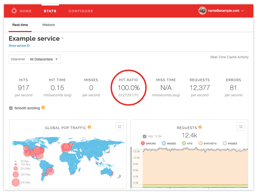
Sometimes the tiniest changes can make users extremely happy. When we dug into user behavior, we noticed that people were navigating between our historical stats and real-time stats pages, which indicated some confusion. Sure enough, that was validated when we started interviewing users about our current navigation. Because of this, we made some quick changes to our navigation elements, and the feedback was unanimously positive.

Configuration page changes
From our research, we confirmed the strongest drivers of a new customer’s success and happiness with Fastly: creating their first service, adding their first domain and host successfully, and activating the first version of their service. However, it was also clear that customers wanted (and were more successful) when these steps were taken at their own pace, within the context of the application, rather than through the wizard-style quick setup flow we previously used. With this in mind, we began developing a new series of workflows guiding customers to the next step of their success in an unobtrusive, inviting manner. We also took the opportunity to address some frequent feedback on our service configuration toolbar, exposing more critical functions at a top level, rather than nested within dropdowns.

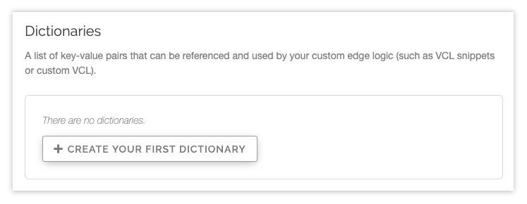
In all, this produced a less restrictive, enablement-driven service experience. An immediate side benefit we noticed after launch was that customers began exploring our in-app functionality as soon as they created their account. Customers were exploring our Image Optimization offerings, Edge ACLs, and Edge Dictionary functionality from the start, quickly prototyping immediate solutions to their needs.

Quick, all-purpose wins
During this deep process of research and scoping, we were fortunate enough to budget resources for small functionality improvements and low-hanging, friction-reducing changes that we surfaced in the discovery process. We shipped small functionality changes that increased user confidence, such as service version rollback notices and condition management. We also added significant improvements to our VCL code-editing experience, and our All Services homepage. You can read a deeper breakdown on these releases here.
Patient investigation pays off
This process of methodically identifying problems, researching solutions, and developing tests and changes didn’t uncover any extreme “silver bullets” that transformed our customer experience overnight. However, taken collectively, these changes had a profound impact on our new service setup rates. Historically, our exceptional customer support and client services teams would help bring the customers who couldn’t fully complete setup up to speed, but that of course isn’t ideal or scalable in the long term. But, the cumulative impact of these changes has increased our customer success rate by nearly 2.3x — which is astronomical, and a testament to what a level-headed approach to identifying and fixing problems in a new customer experience can yield.
There’s more ahead
First of all, this work is never done, and your opinions shape our planning. If you have feedback or ideas that you want us to implement in the future, email us at support@fastly.com or let us know on Twitter.
The processes and changes outlined here were the result of many months of work, but this system of researching problems, developing solutions, and shipping improvements to customers is a cycle that has reached an impressive level of momentum here. We’re hiring across our engineering, product, design, and many other departments, and if you want to be a part of a team that drives substantial changes for the users that powers the internet, we’d love to have you on board. Fastly is a place where you can truly do the best work of your career — and we’re just getting started.
