If you have logged into Fastly recently you may have noticed a substantial change in the layout of the Control Panel. To support our growing product line we launched a new navigation and a more robust search interface. The new experience accommodates expanding product lines, improves usability and accessibility, and helps customers discover new features that help optimize their applications. The new search allows you to easily find services, domains, users, and TLS certificates.
Challenges with the previous layout
The previous design for the Fastly Control Panel included multiple, horizontal rows of navigation. This led to a phenomenon we called “tab soup” where stacks of tabbed navigation became almost invisible at the top of the screen where they were crowded. We were running out of space to grow with our expanding product line, and deep navigation into other parts of the UI was arduous. The previous layout wasn’t fully mobile-friendly and had issues adapting to different screen resolutions. Additionally, our search experience didn’t accommodate searching beyond service-level metadata.
Customer-centric design
In the discovery phase of this redesign, we carefully considered our user base, their preferences, and workflows. We diligently tested our design components, fine-tuned animations, and carefully adjusted screen resolution breakpoints to optimize the user experience for multiple devices. We also honed in on core design principles we wanted to adhere to, including scalability, improved wayfinding, and discoverability.
As we examined various design options, we searched for scalable, enterprise patterns that would be optimal for our users. Enterprise interface patterns are collections of interface components that make it easy to grow a feature and product set in a complex application. These components help manage complexity, allow for greater control, and, most importantly, reduce toil for our end users. We didn’t want the interface to get in the way of productivity.
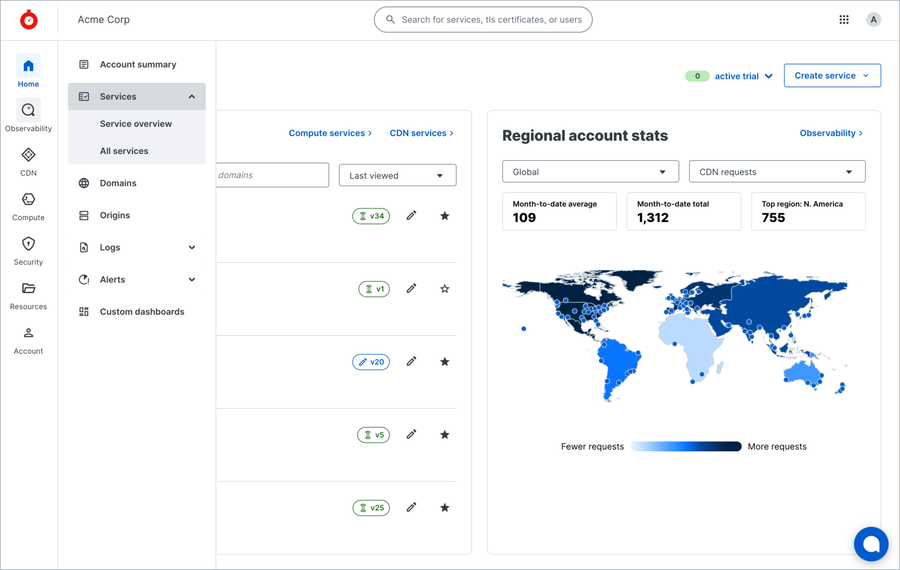
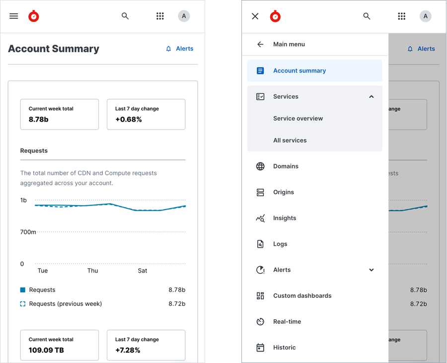
After identifying common navigation patterns, we decided to try a few by prototyping different design options for the Fastly Control Panel. We tried the hamburger menu (three lines = bun + meat + bun), the waffle icon (six squares, hold the syrup), and icons both with and without labels. We ultimately landed on a three-tier, left-hand vertical navigation, a top bar for search, and the utility drop-down menu. The persistent left navigation rail contains icons with labels that can be hovered over to reveal a flyout menu. The flyout menu drawer improves your workflow by helping you easily navigate to features and discover new products without having to leave the screen you are on. When the browser window is large enough the secondary menu will stay persistently open. When the screen resolution is mobile-sized, the menu collapses into a hamburger or the three horizontal lines icon.

Fastly Control Panel with the Observability navigation drawer open for desktop screen sizes
Accessibility
Inclusivity is a core part of Fastly’s values. With the opportunity to develop a brand-new navigation system, we took the chance to improve accessibility in the Control Panel. This included implementing keyboard shortcuts and navigation and incorporating accessibility best practices. For example, Search can be activated by typing “/” and closed by pressing the Esc key on the keyboard. The navigation can be accessed via the tab, arrow, and Enter keys.
Multi-screen size support
Our customers might be working from a coffee shop, in front of a monitor at the office, or quickly troubleshooting on a mobile phone at the airport. It’s crucial that the Fastly Control Panel is adaptable to our user’s preferences. In the latest version, the navigation responsively adjusts according to the screen size. While some feature pages are still catching up, we are committed to making incremental, responsive improvements to all screens in the Control Panel.

Mobile navigation in both closed and open states
A better search experience
Recognizing the importance of search functionality, we invested heavily in a new Elastic search engine. Our goal was to create a fast, intuitive, and accurate search that is accessible from every screen within the Fastly Control Panel.
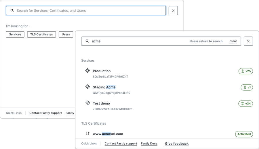
In addition to services, you can now search for users and TLS certificates. Our revamped search experience is more intuitive and includes advanced filters, recent searches and suggested queries.
This launch is only the beginning, we are committed to collaborating with our customers to make search even better. We plan to add more features that significantly reduces effort and increases operational efficiency for our customers.

Search empty state prompt and results views
Customer feedback loop
We tested the new navigation designs with internal stakeholders, customers, and new-to-Fastly users. The new navigation and search were initially launched as an opt-in beta, allowing customers to self-select to try it out. During the four-week beta, we were thrilled to see a third of Fastly customers trying out the new navigation. We also implemented in-app feedback surveys which allowed beta participants to provide input on what they did, and didn’t like, about the new design. With early feedback, we were able to iterate and make improvements to the navigation such as menu behavior with various screen sizes.
Navigating the future
With the launch of the new Fastly Control Panel search and navigation, we laid the framework for scaling our customer experience for years to come. Look for updates to search as we index more content, add shortcuts to make your workflow faster, and ease of use updates such as search as you type. Head over to manage.fastly.com and try out the new experience. We are always looking for ways to improve. Send any feedback to design@fastly.com — we look forward to hearing what you think!

